Yurii Vitiuk
← Back to Work

Case Study 01

VPRITUL

Donation platform for Monobank × Впритул. A complete design pipeline — from competitive landscape to a pixel-perfect design system — built through 12 rigorous stages.

Client
Monobank × Впритул
Role
UX/UI Designer, Design Lead
Pipeline
12 stages, 6 deliverables
Verdict
GO
Open in Figma →

The Challenge

Ukrainian charitable giving needed a platform that matched the speed and trust of mobile banking. Monobank — Ukraine's most popular neobank — partnered with Впритул, one of the country's largest charity platforms, to create a seamless donation experience. The challenge: design a system where every donation triggers a matching double contribution, creating a "Double Trail" effect that amplifies generosity.

The platform had to work within Monobank's existing ecosystem while maintaining the emotional weight of charitable giving — not just another payment flow, but a moment of genuine human connection.

The Pipeline

This project ran through a complete 12-stage design pipeline, each stage building on the previous with documented decisions and critique gates:

  1. Research — Competitive analysis of 8+ donation platforms (GoFundMe, Monobank Charity, Впритул existing)
  2. Strategy — Positioning, user personas, success metrics
  3. Information Architecture — Site map, navigation structure, content hierarchy
  4. User Flows — Donation journey, onboarding, error recovery paths
  5. Wireframes — Low-fidelity structural layouts for all key screens
  6. UI Design — Component library, screen compositions, interaction patterns
  7. Design System — Tokens, typography, color, spacing, component specifications
  8. Visual Polish — Pixel-level refinements, micro-interactions, transitions
  9. Accessibility Audit — WCAG 2.2 AA compliance review
  10. Design Critique — Senior-level zero-tolerance review
  11. Prototyping — Interactive HTML/CSS prototypes
  12. Report — Final deliverable documentation

Key Concept: Подвійний слід

The "Double Trail" is the emotional and functional core of the platform. Every donation creates a visible ripple — the giver's contribution is matched, doubling the impact. This isn't just a feature; it's a design philosophy that shapes every screen.

The visual language reinforces this: paired elements, mirrored layouts, and a sense of growth that's both personal and collective. When you give, you see your impact multiply in real time.

12
Pipeline Stages
6
Visual Deliverables
×2
Donation Matching
GO
Final Verdict

Outcome

The project received a GO verdict after rigorous critique. The design system was built to scale — reusable tokens, documented component states, and accessibility baked in from stage one. The pipeline itself became a reference for how AI-directed design can produce shipping-grade work.

Visual Deliverables

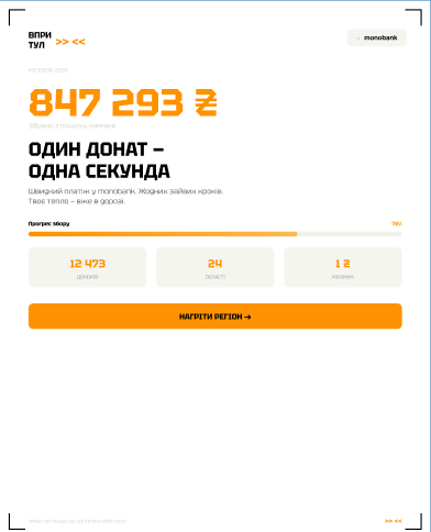
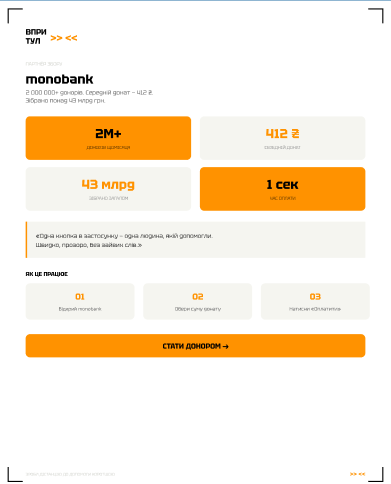
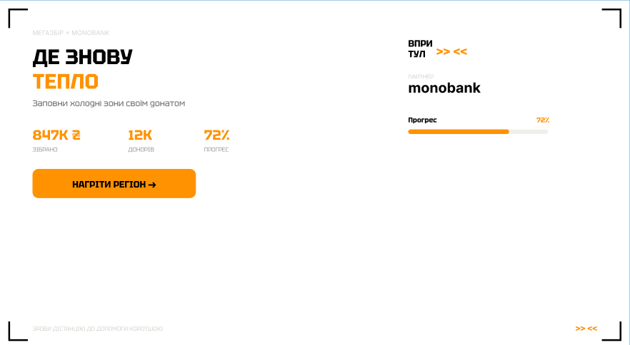
Final compositions designed in Figma (page V2) — the campaign-ready set for the "Де знову тепло" (Where It's Warm Again) donation drive: company banner, feed post, and partner stats slide.

Company Banner (1080×600)
Instagram Feed Posts (1080×1350)

Deliverable Set

The full campaign also includes a 1080×1080 quest visual ("Квест: Тепло" with live progress and dual CTA) and a 1080×1920 stories format with region map legend — available in the Figma file.